Inside the Mirror Studio
  • FILM
  • Illustration
  • Film Score
    • Music/SFX Service 音樂音效服務
    • Student Production Special 學生製片優惠
  • Mirror Su Music
  • Personal works
  • Store

Colors in Moives

2/25/2016

2 Comments

 
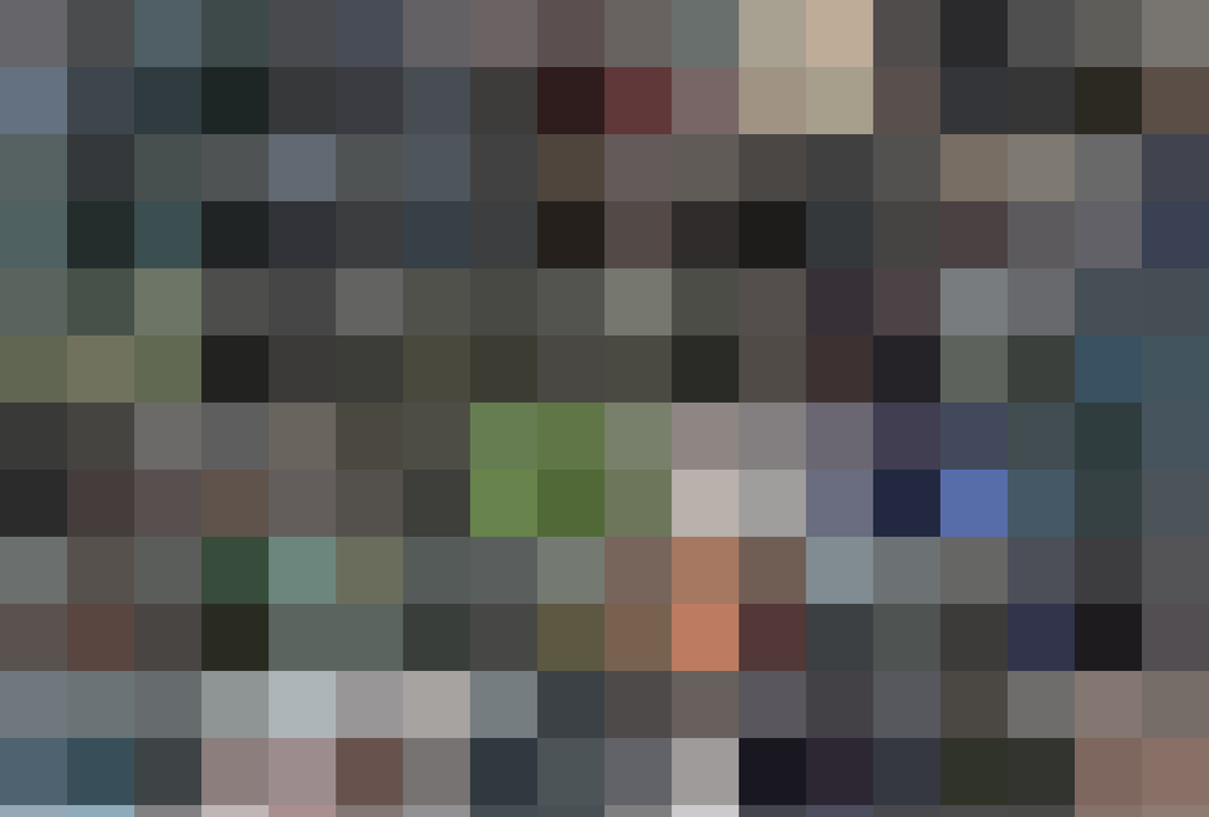
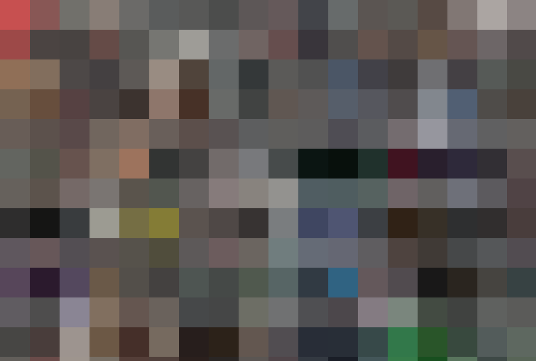
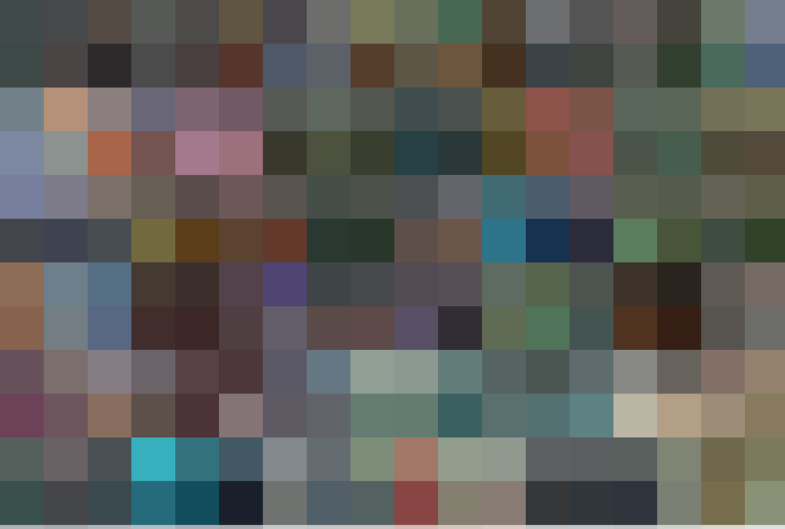
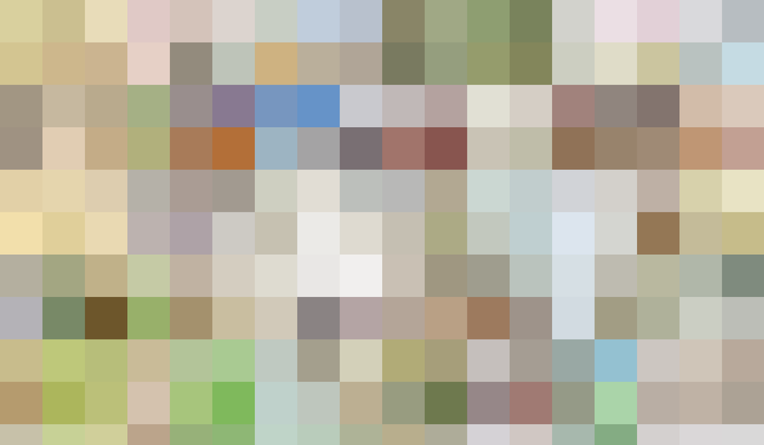
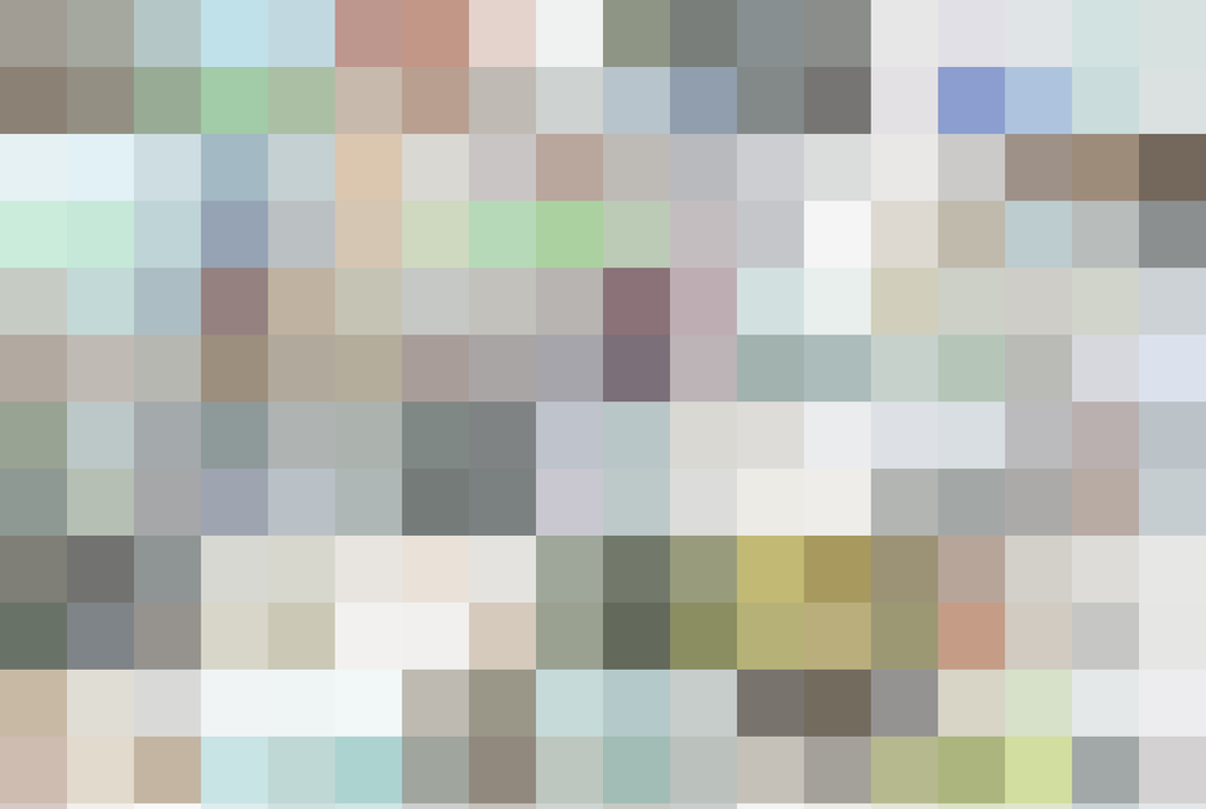
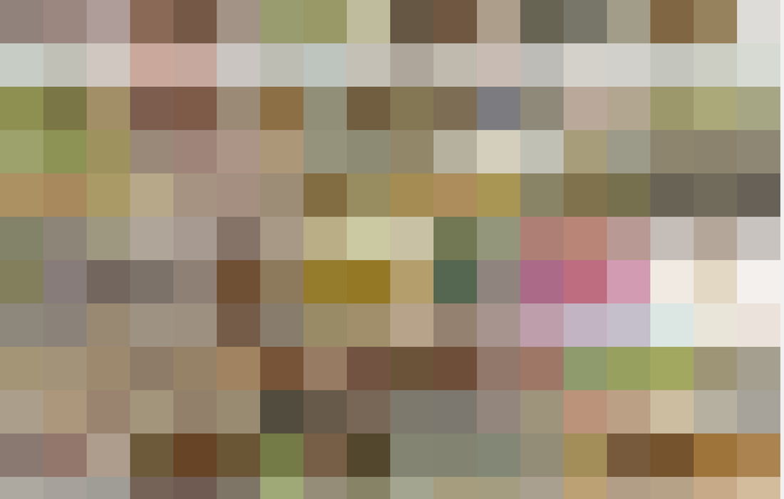
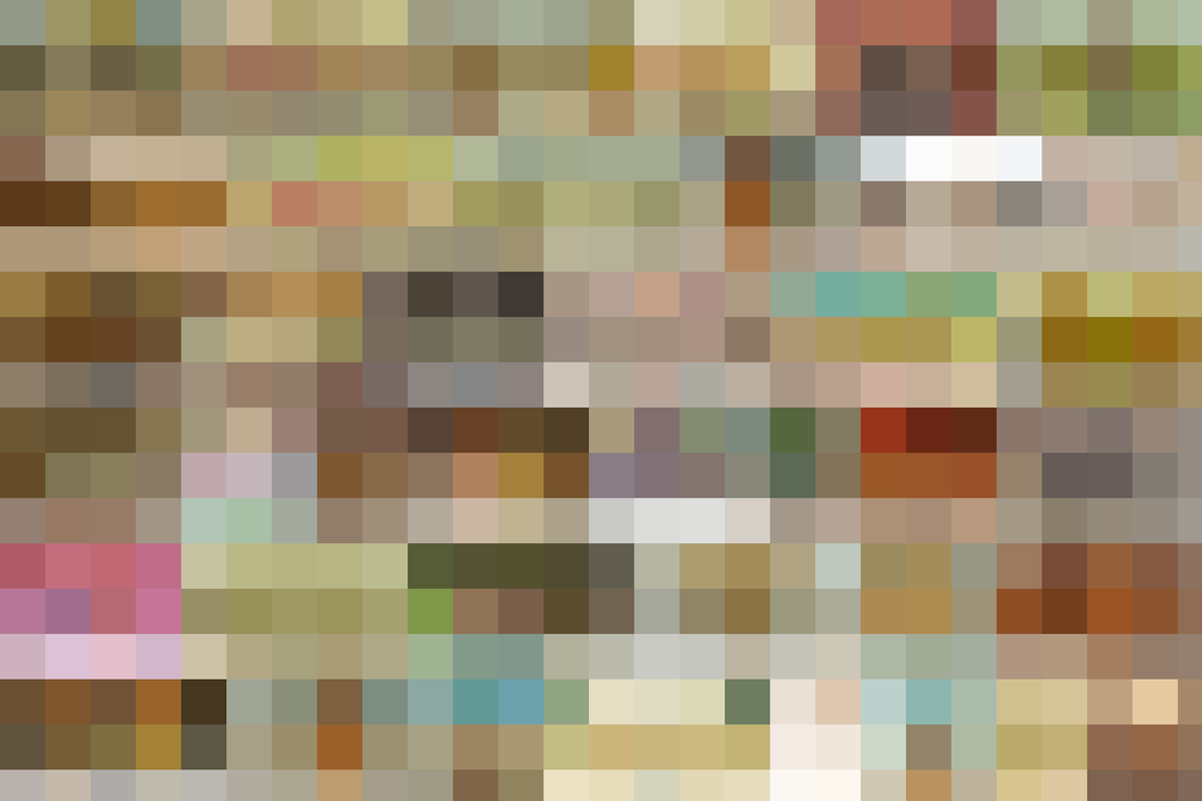
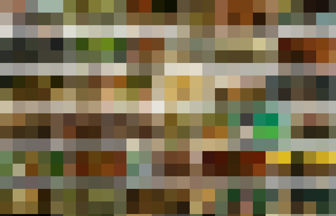
I don't have a sharp sense when it comes to color. I try different ways to define a color scheme whenever I start an animation project. One of the ways I use is type a keyword into Google image search, capture a screen shot of the result, import into Photoshop and apply the Mosaic effect:

 For example:

warning: There are scary pictures down there...

I typed "日本恐怖片 " (Japanese horror film) into the search bar, and the result is here:
(I mosaiced it a bit, because it's too scary :/)
​
Picture
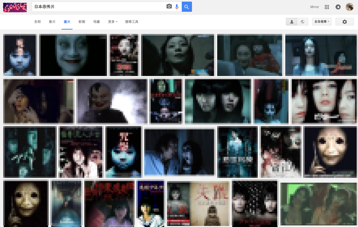
I took a screen shot and import into photoshop, apply Mosaic effect:
Picture
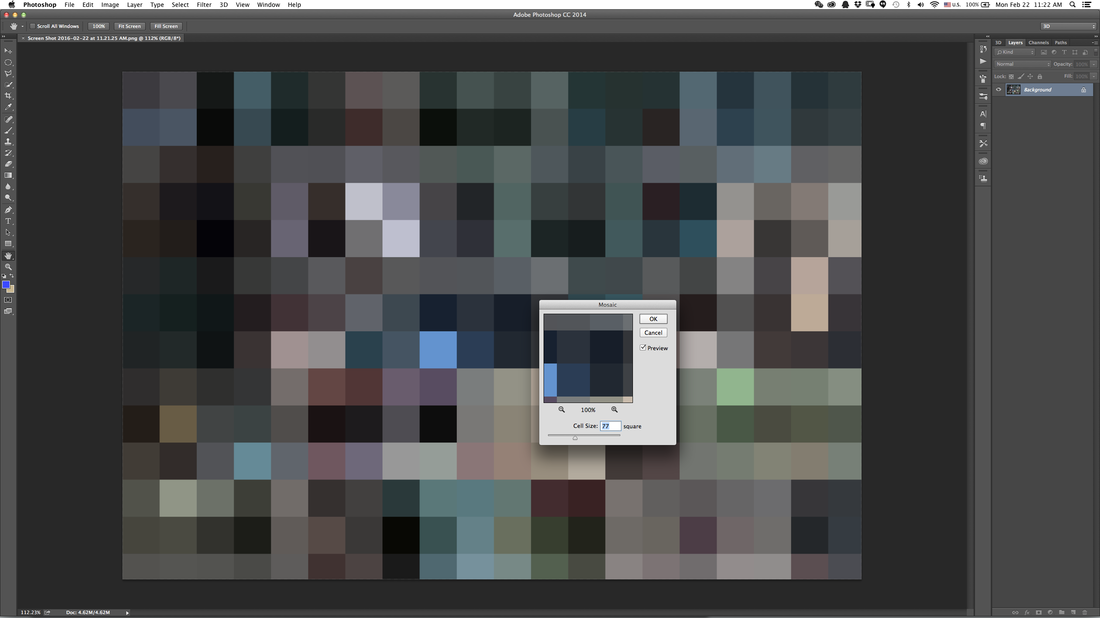
And there you go! You got a Japanese style horror film color palette! 
​
This is really fun to play with, so I tried different keywords to see the results. It's interesting to compare different region's horror films.
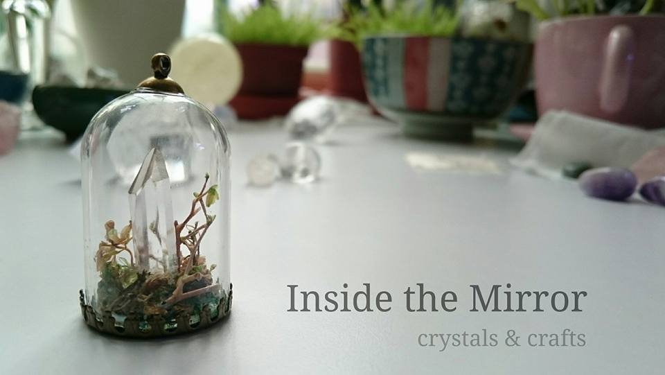
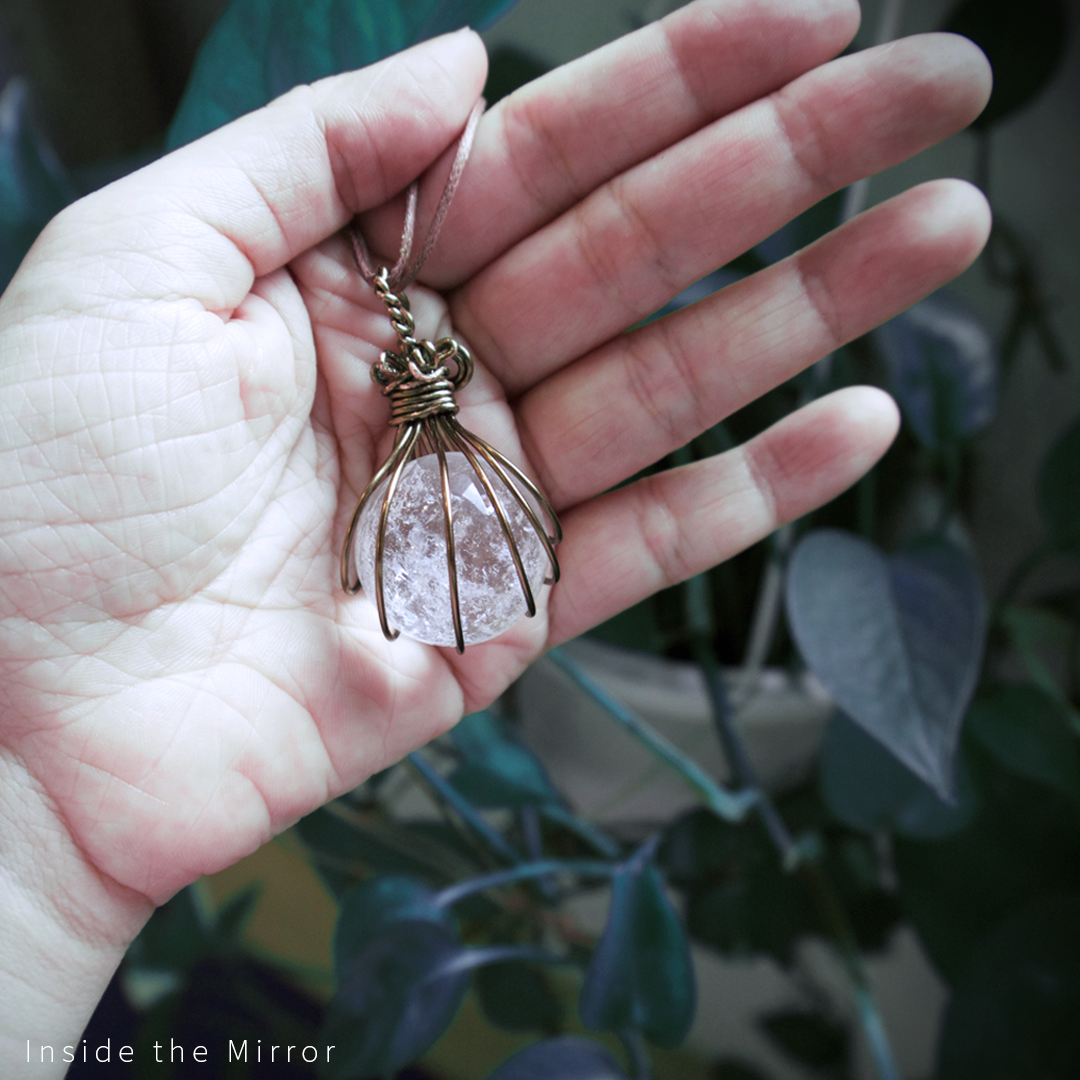

日本鬼片
​Japanese ghost film

It's grayish and cold.
Picture


​泰國鬼片
​Thai ghost film

It's also grayish but the saturation is heavier than the Japanese horro film.
Picture


香港鬼片
​Hong Kong ghost film

The colors are more vivid than Japanese or Thai horror film.
Picture

Yyou can type in other keywords, such  as:


​日本溫馨電影
​(Japanese heart-warming movies)

Picture


​日本空氣感攝影
(Japanese airy photography)

There is an airy look in Japanese style photography. It's pleasant and relaxing to look at. And notice that Japanese visual style is usually cold and light.
Picture


Wes Anderson movies

And of course, Wes Anderson's movie color palette. His movies are often warm and light. (And he likes pink, doesn't he?)
Picture
Picture


​Jean Pierre movies

His use of color is warm yet saturated, and it's quite heavy. If you add a bit gray into this color scheme, you could also create a horror film color palette...
Picture
I don't know if this method will help or not, but it's fun to play with and try out. 
​

If you're interested in learning more about color palette in movies ,here is a great site:
Picture
And if you're intrested in finding out populr color scheme at the moment, here is a free tool online:
​Adobe Color CC
Picture
If you have any other technique to build your color palette, please share with me :)
2 Comments
Rebecca Stout link
10/13/2017 05:02:18 am

Using colors in the photoshop is the best option but mostly people do not know how to use best colors

Reply
uk best essays link
10/27/2017 01:09:26 am

When applying the technical aspects of color in the movie, the palette, hue and schemes should be considered. Movie is should be pleasing to the eye when watching it and the colors should be properly associated to one another. Your movie should have these technical aspects in mixing and applying colors because it brings a lot of beauty and uniqueness in the film. Additionally, colors in movie can give us a hint in which genre it belongs and also, in what timeline it produces or belongs. Creativity in playing and mixing of colors could give the film a major enhancement and improvement.

Reply


Leave a Reply.

    Mirror Su

    Here I share not only about animation, but also crafts and stuff.


     Official Facebook Page

    Picture

    Mirror's Crystal & Stone-
    Facebook Club

    Picture

    Mirrorsu Crystal - Instagram

    Picture

    Secret Door

About 
Contact
Store
Download

mirrorsu@gmail.com
​
+886-963-876-736
© Inside the Mirror Studio 2018
  • FILM
  • Illustration
  • Film Score
    • Music/SFX Service 音樂音效服務
    • Student Production Special 學生製片優惠
  • Mirror Su Music
  • Personal works
  • Store